Wednesday 11 January 2017

Summative Statement

The practical work for this project investigates the morality of working to a brief which commodifies a social issue. It aims to cause a conflict of priorities between professionalism and personal morals. The brief is to produce a body of imagery that raises awareness of dementia but the imagery also needs to correspond to the vintage trend to ensure the final products are commercially viable. The brief is purposefully ambiguous about which aspect is the most important and it therefore forces the practitioner to make their own decisions, conscious or unconscious, about whether to prioritise the social issue or the marketability of the outcomes.

It could be argued that the intentions behind this project are dishonest but the real intention is to demystify the dishonesty of the commodification of social issues in our everyday lives. The process of applying imagery relevant to an issue onto unrelated products that we use every day provides an insight into how simple it is to persuade consumers to buy products purely because they have a ‘socially responsible’ message. Consumers surround themselves with products they feel represent their own values and this is why the products that display these values are increasingly popular. They help people to show that they are a good person, without having to actually do anything good at all.

The message for sale here is ‘I care about people with dementia’ whereas the action of purchasing these products actually displays the message of ‘I care more about products than about people’. 
Presentation Boards

Visual and Conceptual Development

Tuesday 10 January 2017

Final Book


(The physical copy of this has been submitted.)


I think the decision to make a final product instead of just proposing my product range on presentation boards has worked well to finalise the project and bring it to a conclusion. Putting a price to the image makes it clear that these products are for sale and the inclusion of the text on the back ties this in to the selling of values which synthesises with my essay. 

I think the mockups themselves look professional although I wish I had given myself more time for the printing and binding process. The rush in the print room meant that the pages were printed on thinner stock than I would have liked and I think this hindered the binding process and made the stitching looser than I had wanted it to be. Although I feel my time management for this project has been okay, I didn't take into consideration how busy the college facilities would be towards the end of the project - this is something to consider for future modules, especially when the digital print facilities are concerned. 

Time Management Reflection

I have to say I have really struggled to stick to my time plans for this module, mainly because my project was so uncertain at the beginning that I didn't really know what to plan for. I understand that it is important to plan ahead, and I have been able to use my time plans as a vague guide for where I should be at certain points, but I find it much easier to plan out my workload on a weekly basis. This usually happens after a tutorial or crit when I have a clear sense of direction and I can plan to achieve what I want to for the next check-in point. 

I think my organisation overall has been better than usual for this module, especially considering past experiences of context of practice. This is a module I often found hard to feel motivated for and therefore key putting things off, but this year I have actually been interested in what I am investigating and this has meant the process has been overall more enjoyable. Doing my research over the summer helped me so much because I could actually spend the time properly reading what I needed to read instead of skimming books under pressure. I can't believe I'm saying this but yes, cop has been moderately enjoyable. 

Anyway, improvements for time management for future modules...
  • Use a long scale time plan to mark out mini-deadlines to stick to. 
  • Make separate time plans on a weekly basis or whenever appropriate to make sure these mini targets are reached. This allows the planning to be more adaptable and takes into account a change in direction of project or unforeseen circumstances. 
  • This will also help me to avoid feeling like I'm going off track or I'm falling behind just because I'm not meeting those initial targets I set for myself which are no longer relevant. 
  • Use time effectively! Don't sit staring at a computer screen with a mind blank for hours when I would much rather be drawing. And when I do actually feel like writing/blogging, make the most of it! 

Saturday 7 January 2017

Project Impact

I thought it would be a good idea to reflect on this module and how it has influenced my practice and also how it has affected my view of illustration as a whole. 

I spent the first half this module totally confused about what I was going to make at the end of it. I understood the theories I was looking at and how this related to illustration but I just couldn't put pen to paper. I needed to research more and more before I reached a point where I knew what I was doing with my practical work. This rut helped me realise the value of research. I was so frustrated with myself that I couldn't just start making work but I knew it would be meaningless until I had reached a point where I fully understood what I was doing. I am keen to have a few research driven projects as part of the extended practice module because it keeps me on my toes and makes me think about my work in a different way. I feel that it improves the value of my work and I feel so much more comfortable presenting it as mine when I know I have the knowledge to back up all the decisions I have made. I can see how the research process has really driven my work for the whole of this module. 

The topic of social responsibility has made me think a lot about my future practice. I always thought to myself that whatever work I do professionally I want it to be for the right reasons, I want it to be authentic and true to my own morals. Whereas now, the idea of a moral practice is a bit of an alien concept in my mind. This project has made me realise that there isn't this fantasy job where everything you produce makes the world a little bit better and everyone is always happy and nobody is ever trodden down. It's just not true, it's just the way the world works. I don't mean for this to sound harsh but it has made me open my eyes to the industry I am entering and made me screw on a professionally focussed head. Yes, positive things can be done with creativity but at the end of the day I will need to make a living and I will have to do things I maybe don't want to do. I just hope I can also do things I am really passionate about as well. I will also be careful to give consideration about who I want to work for and who I allow to use my work. There are some companies who, at this point in time, I tell myself I will never work with, but it would be interesting to see whether I stick by these morals in five years time. 

This project has opened my eyes to the deception of advertising and I now find myself being more aware of the techniques used to target me everyday. Obviously I am still influenced by adverts, most likely more than I even realise but I feel hope that I am now slightly harder to entice than I was before. 

Friday 6 January 2017

What am I going to make?

Since the crit today I have now got a clear plan of what I am going to produce for submission. I had initially intended to present my product mockups on presentation boards, however over Christmas and the last few weeks I have been feeling that this doesn't show my concept as well as it could do. 

The main points I want to show are that the issues are being sold and that the products will exist as part of people's every day lives, in the home environment. 

I am going to make a small product catalogue after having such positive feedback on my mockup in the crit. The design is going to be kept simple, the main point of it is to showcase the products. 

I think a small description or tagline is important because I have already established from talking to people throughout my project that the concept needs to be made clear. This could feature on the inside cover or on the back cover. I suppose the back cover makes the social issue feel more like an afterthought - which kind of represents the idea of my project that the products take priority over the issue. I took inspiration from my early sketchbook research into brands selling an idea. 


Ideas for description...
You can enjoy these beautiful products safe in the knowledge that you have done your bit to support people suffering with dementia. 
Socially conscious products.
Distorted Memories is proud to raise awareness of dementia.
We want to make a difference. Working together. Support people. 

'By choosing the Distorted Memories range, you’ve chosen to support people suffering with dementia. 
You can enjoy these socially conscious products safe in the knowledge that you are making a difference.'

I decided a while ago on the name 'Distorted Memories' as a kind of working title for the project. I'll change this to 'The Distorted Memories Collection' for the final book as it makes it more commercial. It still makes sense once the concept is explained but it would be interesting to see, when complete, how many people question the meaning of it at first glance. 

The book will feature between 8 and 12 mockups of my designs on products and a product name underneath. I had a bit of a dilemma over including prices, catalogue numbers, etc and thought process would be best as it drives home the idea that these are for sale. I'll try and so a bit of research into pricing the relevant products but this isn't really a priority. I just want the price range to reflect the audience - a middle ground price range, not a luxury product but not budget either. 


I have been experimenting with book binding since the workshop we had before christmas and I have learnt how to bind single sheets through tutorials online. I am going to use this method to bind this book together as there won't be and excessive number of pages and it will be printed on quite thick stock. I made myself a mini sketchbook to practice. 


Final Crit Feedback

Presentation boards as shown at final crit


Feedback


  • Things don't need to be repeated on blog and presentation boards. 
  • Summative statement is good. 
  • Blog my mockups and most recent practical work. 
  • Blog about what I am definitely going to make. 
  • Cut down the information on my boards. 
  • Make finals into a product catalogue format for presenting. 
  • Alter research board to concept and themes board. Include vintage trend research in this. 
I found this feedback really constructive and I feel like I know exactly what I need to be doing to get everything finished on time. I am pleased the idea of a book of products got a good response as it conveys my concept better that presentation boards would. I will still be producing presentation boards but about the concept and development of the project building up to this point.

Self Evaluation

What have I learned from this module?

1. A wholly socially responsible and selfless practice is just not achievable as an earning professional. It has made me think differently about how I tackle social issues in the future as it has made it clear to me that just mentioning what is happening in the world doesn't bring change.

2. It has made me think more about the effect the application of imagery can have on the overall concept of a project. I think I finally understand the true importance of context and how it can really impact on the message of my work. Choosing appropriate or inappropriate places to display work can really alter the impact it has on the audience. In effect, the contextualisation of my work is what actually answers the whole brief in this project, the images alone would only be touching the surface.

3. My view on image making has evolved more towards shape for this module. I always steer towards line, its just what I do and its how I translate what I see onto paper. This module has made me think about breaking down images into shapes and showing how forms can be made from flat shapes with no outlines at all. I think this is something I can see influencing my work in the future. I have already been thinking about the potential of taking these into screen print or even just improving on my painting. There is more to life than line!

4. I feel like I have learned from my mistakes in level 4 and 5 cop modules. I would always leave my practical work right to the last minute and it suffered because of this. I feel like I have finally learned my lesson and have really forced myself to keep my practical going while still essay writing. There may have been dry spells where the practical work was lacking but I do feel the two parts have worked well in parallel especially in the later stages of the project and this has led to a more cohesive project as a whole. 

5. Stressing only makes things worse. I am really surprised at how level headed I have been about this module. The idea of a dissertation was daunting enough, let alone with a practical project that needed to fit in with it. I think I am finally learning that stressing about work doesn't make the situation any better. Only doing the work makes things better. I think I am getting better at realistically evaluating what is important and what isn't. Looking back, my time management has probably helped with this, sticking to smaller deadlines within the module has meant I haven't been falling behind. 

What could I have improved about my approach to this module?

1. It's easy to say in hindsight that it would have been better if I had clarified the brief for my final practical project earlier. It would have allowed me more time to develop the visuals. However, maybe the conceptual development may have suffered and I am glad I spent the time getting this straight in my head. 

2. I think audience is something I struggled with. I knew the practical outcomes needed to fit the vintage trend but I didn't realise how wide the audience is that this appeals to. I stated young adults but realistically I think some of these products would be appropriate for a market slightly older than this too. 

3. My intention all along was to use digital mockups to show my designs in context. What I didn't take into account was the style of mockups that would be available to me online. I have tried my best to select ones which fit the overall style of the work and the vintage trend but some do look a little too polished in my opinion. I suppose this widens the scope of appeal but it also makes the presentation book a little less unified. The thing to improve here would be preparation and planning ahead, maybe taking some of my own photographs or learning some ways to alter the images to a greater extent to fit my theme. 

4. In hindsight, I feel like it may have been more appropriate for my brief to actually be for an existing brand. I know I have kind of created my own brand but I think using an existing one may have conveyed my idea better. It would have also given me a target audience and price range to work to which may have been more appropriate to the concept of a 'commercial brief' than deciding these myself. 

5. Looking back I wish I had been more experimental with media and not just stuck to working in my sketchbook. Lino printing experimentation came a little too late but I realised that there was so much more I could have done to drive the practical side of this project, especially in the realm of traditional printing. The essay always seems to take priority and I think this is because it is the part I find hardest so I know I need to spend more time on it. It's hard to find the perfect balance. 

What actions will I take in response to the peer review session?

1. I can now go ahead to complete my final product which is a catalogue for my product range. I still have time to get this printed in the print dungeon and I am planning on binding this by hand as single sheets so the book lies perfectly flat. 

2. Reflect on how this project has affected my view on illustration. It has provoked some real thought into the authenticity of a socially conscious practice and I think it would be good just to summarise how I feel this will affect my own practice. 

3. Edit my presentation boards as suggested in my feedback and get these printed A2 using the digital print drop off service. 

4. Make a few alterations to my summative statement. I got good feedback on it but there were a few notes to improve. I think I could make it a bit clearer and written a bit better. 

5. BLOG. I am almost up to date on my blog but so much has happened in this past week that it is not all up to date. I need to make sure my blogposts are especially evaluative at this late stage in the project because I need to start tying the whole thing together. 

Thursday 5 January 2017

Initial Mockups


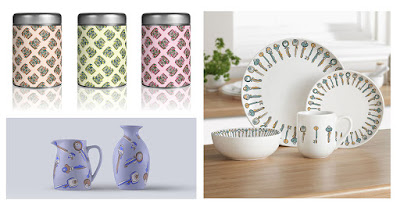
These are the mockups I have managed to complete in preparation for the crit. I have made them into a book format to get some feedback on the side of presenting them this way. It looks a bit like a catalogue but I would like to see what people's opinions are between this idea or just presentation boards. 

I am planning on making more mockups than this but I think the five I have completed here give an idea of the product range I am going for. 


Final Images

After my linocut printing session, I tried to mimic the process of mis-aligned prints using the lightbox and tracing over photos of different designs of telephones and cameras. After some experimentation, I had four of each object to select the best from. I then painted these selected designs using gouache, painting block shapes in three colours, making decisions about light and dark to show form and the separate components of the object. For the keys I used a simpler process as they are much less complex shapes. I did this by eye, making decisions about shape from looking at reference material found online. I then used the lightbox again to draw the outline with brushpen on a separate sheet of paper in case of any mistakes. I selected the line I thought worked best for the image and combined them on photoshop.

(All work mentioned here is evidenced in physical submission - selected developmental work.)

Final Images

I am really happy with these outcomes. I wish I had given myself enough time to do more than three objects but I think this is enough to get across my idea for the project. It could always be proposed that there would be other designs to fit into the same range. These outcomes achieve what I was aiming for, they show he confusion and distortion that relates to dementia but the images are still clearly recognisable and marketable. I have received really positive feedback from my peers in the studio and I suppose they fit into my target audience so thats a good sign! aI now need to look at altering the colour of these images, making patterns and applying them onto products. 


Individual Tutorial 6

Where am I at?
Chapter 2 and 3 are complete. 
Introduction, conclusion and chapter four all need to be finalised, although they are almost complete. 
I have a plan for finalising my practical work, just some confusion about how to present it. 
I have a few essay formatting questions.

Feedback from Tutorial
Complete introduction and conclusion. 
Chapter four is coming along well, avoiding the use of first person well. This needs completing - this is possible now I have got this far with my practical and have made some decisions about the issue/marketability conflict. 
Think about applying a ‘brand' to the final presentation of my practical work. 
Contextualisation of finals… a label? title? tagline? Look back to old sketchbook work which pairs values with brands. 
Think about the idea that the images are nice to look at out of their context. The socially responsible intentions are only made clear when an explanation is given. 
Make sure my blogging for my practical work is all up to date. 

Next Steps
Finish my dissertation by the end of the weekend and get it printed and bound on Monday. 
Concentrate on practical work and presentation after this. 
What questions to I want to be answered at the crit tomorrow? How can I get the most out of this session? I am going to spend this evening working on my practical work to get it to the point where I can ask for feedback on it in the crit tomorrow. THEN finish my dissertation. 

Wednesday 4 January 2017

Linocut Printing


I cut all my lino pieces from reference photographs. Each piece itself if representative of the right shapes, the idea for this is that the misplacement of lino pieces will cause the confusion in the image. 

I had used gouache for a text print in a previous module and it had failed. However, I knew that for this brief I wasn't looking for a perfectly printed outcome so I gave it another go. (red and orange print) It does just look messy. I think the hard part with this project is finding the balance between a confused and mis-matched image and something that looks well crafted and considered. I don't want to compromise on the quality of my outcomes. Gouache is not going to work. 

I printed my linos in the print room with the proper inks and the results were much better. I was going into this thinking these could be used instead of my previous gouache paintings or maybe combined with them as a collaged element. I think this process has some merits, I like how the image is still recognisable as a camera even though lots of the components are missing and the remaining ones are places awkwardly. 

I feel like I have started with this process a little too late into the module. I would have loved to have carried on with this process and see how I could push it but its just not realistic at this late stage. 

What have I learned from this?
  • Not a good example of time management - why am I still experimenting at this point? I should be working towards the production of my final pieces. 
  • The process of printing these in stages has helped me figure out how to tackle placing each of my image elements. The shift and mis-matching of the pieces has created an effect I like and I think I can translate this into my gouache work. 
  • It has also made me consider the minimalism of some of these prints. There really aren't many elements present on the page yet the image still works - remember not to get caught up in little details! It works better without showing everything and it fits the concept too. 

Tuesday 3 January 2017

Developing Process

Continued sketchbook development on previous key paintings...


I feel like I may have jumped to a quick decision when using the brush pen for the line work. I do like the way it works but I want to try out a few other options to check I am making the right decision. These are some gouache paintings I did, then photocopied to experiment with line on top of them. 


Ink and end of paintbrush - this makes the lines a lot thicker so continuous line would eventually look clumpy. I opted for minimal lines to show shape and suggest detail. It fits with the idea of things being fragmented and pieces missing. 


Pencil crayon and fineliner - the pencil looks too grainy and doesn't provide enough of a contrast against the block colours. The fineliner causes a similar problem due to how thin the line is. When the lines are gone over more than once they begin to look messy. These are both not working.


I like how my line work is improving the more I do this. I feel like I have a good control over the brush pen and the process shows confusion but not clumsiness. The brush pen is smooth yet still shows a tangle and confusion.

I asked some of my peers in the studio for their opinions and this final page (pink and green) was a clear winner. It was interesting that they didn't even know what the project was about but they sad these looked the 'nicest'. After I explained the concept to them they understood better and still agreed that this one worked best. This is what I want, my concept needs to be reflected in the drawing style but the images need to be appealing to consumers if the aim is to make people buy them. 

Monday 2 January 2017

Subject Matter Research and Decisions

Over Christmas I gave some consideration to the subject matter I am going to use. I visited some shops in Leeds and back home in Loughborough. I also used old reference photos for past projects for inspiration. 
  • Blue Rinse, Leeds. 
  • Retro Boutique, Leeds. 
  • Swiss Cottage, Leeds (photographs I already had). 
  • Winged Ape, Loughborough. 
  • Loros, Loughborough. 
  • Loft, Loughborough. 
Potential subject matter...
luggage tags, keys, crockery, watches, clocks, cameras, fountain pens, ornaments, souvenirs, typewriters, picture frames, telephones, jewellery, glasses, tickets, shoes, corks, buttons, records, books, chairs, hats, suitcases, sports equipment, shirts, televisions, toys...

The ones highlighted in bold are the ones I think have potential. 

Subject matter decisions:
Cameras - I have been using cameras to experiment in my sketchbook. I like that they resemble the idea of capturing a memory, it relates to dementia well. 
Telephones - This resembles communication. People suffering with dementia struggle to communicate with other people and the world around them, not only because of confusion but also because of speech difficulties in sever cases. The telephone also connects to the technological advancements of the 50s, the style of the phones I will draw will reflect this era. 
Keys - I think keys represent the home and places that are familiar to you. They represent responsibility and independence which are both things that are lost by someone with dementia. Keys are also things that people lose al the time so they connect to the idea of memory loss and general confusion. 

If I have time I would like to add more objects to this list but at the moment, these three are the focus. 

Synthesis with essay...
When making decisions about subject matter I found torn between objects that conceptually/metaphorically represent something relating to the issue of dementia (cameras resembling memories for example) and objects that would just 'look good'. These final decisions I am making about the last stages of my project are the ones that are causing the most conflict for me in relation to the brief. Do I go with images that most strongly reflect the issue or do I choose the ones that are most marketable? At the moment I feel like I am finding a middle ground but some of the conceptual links to the issue are rather tenuous. Maybe marketability is taking priority and I'm just trying to convince myself that its not.