Tuesday, 29 November 2016

Practical Peer Review

Peer Feedback

Main Points
  • Intellectual idea, well understood, lots of research has gone into it. 
  • Good understanding of how media can enhance the concept. 
  • It would be a good idea to link these products to well known brands. 
  • Think about getting some primary research - surveys or finding examples of consumerism. 
  • Professional presentation so far. 
  • More testing of ideas is needed, more practical work. 
  • It is not yet clear what products I will make - make some decisions. 
  • Its a good idea to propose these rather than make them. 
  • Very thorough project, documented well on blog. 
  • Specific issues need to be selected. 
  • More work needed to develop actual images. 
Response to Feedback

Overall this was positive feedback with some really good constructive comments for improvement and development. However, there were a few things that I also realise I need to do more of. 

The comments on my sheet said I have a lot of research which may be true for my dissertation but I don't feel I have done enough research specifically relevant to my visual project. 
They thought my project was well documented on my blog which may be true for the stages I have gone through but I think that I need to be more reflective and evaluative as I go along. 

I am glad they picked up on that I had no primary research. To get a better understanding of where this concept already exists in consumer culture I plan on going into the city centre and finding real life examples of where virtue signalling and selling values exists on current products. It may also be possible for me to draw from life as primary research if some of the social issues I choose are relevant locally. 

Task


I struggled with this task as I admit I am really bad at making decisions on the spot. I think as a result of this, my sheet just explained the information I had already decided on and didn't help my project to progress that much. It did help me to organise my thoughts a little but in hindsight, it probably wasn't the best description of my project. 

Good things that came from this include the to do list. I now have set myself the task of getting these things done by the end of the week, having lists like this has proven to be a good way of organising myself. Another decision I made was the formats of the images I am going to produce for each issue and also how many issues I am going to tackle. 

Things that remain undecided include the actual issues I am going to work with, the analogue media I am going to use and the actual physical products that I will be proposing. 

All in all, my practical project has not developed as much over the last two weeks as I had hoped but this is mainly down to me stressing over the written side of the module. I understand now that I need to focus on the practical side this week to get the project up to scratch. It needs to be productive! 

I know I need to be drawing more but I also don't want to neglect the research side of my practical project. I will need facial research around social issues to work with although I don't want this to take up too much time this week when I should be drawing.

Sunday, 27 November 2016

Practical Review Presentation Boards


Questions to direct Feedback
1. Is the concept understandable without reading my essay?
2. Should each range of products be individual or work coherently to appear 'branded'?
3. Should the product range consist of products relevant to the issue or should it be pushed to irrelevant products to prove the point of commodification?
4. Is it enough work to just present imagery and propose all of the products or should I be making some?
5. Is my journey so far understandable on my blog?

Practitioner Opinions on Morals Research

Oliver Jeffers - Illustrator and Writer
The objective of my books is to entertain. I think children are possibly getting strong moral messages from every angle, and often they can come across as fake and preachy. Obviously I wouldn’t want to offend anyone, so try to steer away from anything that may be illegal or needlessly dangerous. But, I think the ‘good moral message’ is secondary to the entertainment value where my books are concerned.

In my experience, children are much smarter than they’re given credit for, and curious too. In fact, they’re often more observant than adults, as they give a different amount of time and consideration to something that is in front of them. There’s a difference between education dressed up as fun, and entertainment for fun, it depends on what your objective is. My books are all about satisfying my own imagination; about the things I’m curious about, and would have liked to see in books when I was young. But I try not to be completely reckless, and if education can happen naturally then it’s a bonus, and a successful satisfying story usually will have a few good morals intertwined through it anyway.

Illustrator Lizzie Mary Cullen (illustrator and artist) believes that the very nature of design and illustration means that you can be divorced from the intentions of your clients without being unethical. “I’m not a moral compass,” she says. “The wonderful thing about being an illustrator is the upfront nature of it. An artist may say, ‘I don’t want to sell out,’ but for an illustrator that’s our profession. We get paid to present a certain idea, brand or view.

Kenn Munk - Designer / Visual Communicator
“Visual communication is always about getting people to do something, to steer their behaviour in a certain way – we manipulate. Is it better to manipulate [on behalf of] something that you think is good, or is manipulation in itself bad?”

Rob Coke - Digital Arts - Design and Ethics - Can you stick to your beliefs?
http://www.digitalartsonline.co.uk/features/illustration/design-ethics-can-you-stick-your-beliefs/
Rob Coke, partner at Studio Output in Nottingham, adds that mulling over these issues also makes us question the role of the designer. Are designers neutral observers, arranging other people’s content in a way that best aids comprehension, or more ‘active’ participants in the process of relaying that information?
“Certainly, the decisions a designer makes are not purely based on appropriateness for the job; we are all guilty of allowing personal preference to colour the work we create,” Rob says. “In that respect, every piece of work should be regarded as being ‘edited’ by the designer – perhaps best exemplified by David Carson’s infamous decision to typeset a Ray Gun magazine interview with David Byrne in Zapf Dingbats, because he didn’t believe it told us anything we didn’t already know.”

It is interesting to read practitioner opinions on the topic of responsibility. All of them seem to accept that their practice is not primarily based on their morals, although they do feed into it. 


Thursday, 24 November 2016

Introduction Thoughts and Notes

Ive been struggling to write my introduction up until this point because I hadn't written enough of my essay to understand what needed to go in it. These are my initial thoughts for what could go in my introduction, obviously it needs constructing into a proper body of text but its a start. These notes were made in line with the dissertation guidance document. 

This dissertation is an investigation into social responsibility and analysing whether a corporation’s use of social responsibility as an advertising technique is actually a gimmick. 

It will analyse the use of social issues as advertising techniques in relation to the brand’s actions around the issue. 

Brand images will be broken down and analysed with the aim to understand whether the morals behind this image are genuine or whether the issue is being used as a gimmick. 

It becomes clear early on that there is no black and white answer to this and a lot of the resources referenced in this dissertation are very open to interpretation. 

The question, to what extent is social responsibility used as a gimmick, takes into account this grey area and aims to gather an idea of where the responsibility lies for society. Does it lean towards the corporation or consumer and where does the creative practitioner lie within this?

Subquestions 

A: Where does the responsibility for society lie when social issues are used in advertising?
Is it with the corporation, the creative or the consumer?

B: Are the intentions of corporations genuine?

C: Are the interpretations of the consumer directly influenced by the acts of the corporation and practitioner?

D: As the middleman, does the creative practitioner have a responsibility to society and/or a duty to the corporation? Which takes priority? Money/morals argument. 

Methodologies

A: Academic research, the main theorists being…

B: Aiming to disprove supposedly good intentions of the corporation of two examples (Benetton and H&M). Using practical work to warp bad intentions into something that appears to help social issues. 

C: Academic research, the main theorists being…

D: Research into individual practitioner opinions. Academic research into practitioner relationship with society (art has power) and corporation (need for money). Practical work looking at visually shifting the  responsibility for social issues. 

My position on this question is arguing that the responsibility leans more towards the corporation - this is evident when I am picking holes in their campaigns in chapter three. 

Wednesday, 23 November 2016

Social responsibility - packaging examples

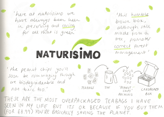
I had my 'wagamama moment' in the back of my mind when I was at home and looking at some christmas presents my family had brought for other people. One of which was some teabags from 'Naturisimo' which claimed to be super eco friendly and good for the planet. I noted down in my sketchbook some of the things that the packaging claimed. 


What struck me was that these tea bags had been delivered to our house in a cardboard box bigger than a standard shoe box. The amount of packaging was overwhelmingly unnecessary yet this company portrayed themselves as 'caring for all that is green'. 

I wondered how many other products did the same so I chose one cupboard in the kitchen (the tea and coffee cupboard) and found the following examples. 


So apparently pukka is all about helping people, plants and the planet. No mention of tea in this little write up, other than that they make you 'come alive' which seems pretty vague. 


PG want to get across that by buying their product, your conscious will be cleared as you drink your tea. I'm noticing some buzzwords cropping up, sustainable being a key one. I am also noticing links to actual organisations such as the Rainforest Alliance which suggests their actions might match up to their image. 


Proud, happy, ambition, successful! All so positive and non-coffee related. Their mention of 'Coffee Made Happy' suggests that this product must meet certain ethical standards for this to be featured. 


The same goes for Kenco Millicano, they have links to Coffee Made Happy as well. One thing I noticed with this packaging is that it mentions a specific issue that Kenco are trying to tackle which gives me more faith that what they have written is not an empty gesture. However, I am still torn by the cynicism that at the end of the day, they are using this issue as a way to sell their product and make money. 


Buzzwords again, they give the idea of community, care and a bigger picture beyond a cup of coffee. 

This exercise has proved to me that there is no black and white answer to whether a corporation is acting socially responsibly or not. I had already figured this idea out through academic research but I have gained a greater understanding by being this through examples. There is a scale of trust but also a scale of deception... are the brands we trust more the best deceivers or ware they genuinely acting on their claims of social responsibility?

Revised Time Plan


Editing my time plan to fit where I am in my project right now made me realise that I am not as behind as I thought I was. I think the pressure of the module and the pace of the work has made me think that I am constantly playing catch up but actually I am more or less around the stage that I should be according to my original plan. My practical work is a little behind but I'm hoping to catch up with this as soon as possible. 

I have been able to fill in the last few weeks more precisely now I have a clearer idea of what I am doing. I have been guilty of not looking at this plan each week when I start work for this module which obviously is not very good practice. I also said that I would review my progress each week which is also something I have neglected and have only done a couple of times. I am telling myself now that I need to pay more attention to my time plan and make sure these later weeks of the module go to schedule. 

Tuesday, 22 November 2016

Draft Alterations


This is what I have of my essay so far, it is a draft of chapter two and three. I wanted to show the process I have found the most effective for revising my drafts. There have been a few of these already and there will be many more to come but I don't feel its necessary to share all of them on my blog, but this is the process I am going through. I read through my printed draft and make any annotations that I feel need changing such as sentence structure, adding in connections to theorists, putting in new quotes and shifting the structure, etc. I then take the notes from the tutorial and add in any suggestions Pete has made and make notes of anything else discussed in the session that might need changing. This leaves me with a plenty of things to alter and improve as I go through my draft on screen and edit the text. I have found writing these notes by hand so much easier, i'm not sure why but my thoughts seem to wander so much more when I am writing on screen. 

Individual Tutorial 4

Tutorial Notes
Response

I totally understand what Pete means about my writing style so far. I do tend to write as I speak which is fine for me to read because I understand it. However, the sentence structures are not logical and I use a lot of unnecessary words in a sentence. It will be through revising and re-revising what I have written that a better academic writing style will start coming together. 


I am a worried about my practical work. Although I have had a bit of breakthrough with it during this tutorial, I still feel like I don't have nearly enough work. The pressure is starting to get to me and this is normally when I am my most productive - I really need to force myself to keep doing sketchbook work and thinking through drawing. 


I have been able to recognise the connections I already have between my practical work and essay but talking to Pete about it today has enforced that the connection isn't being fully made yet. For the connection to be clear and for the synthesis to take place, I need to bring products into my practical work. At the moment I am exploring the idea of a campaign and social issued but I need to bring in what I am learning from my essay and show how an idea/issue can be sold through a product. I am calling this the 'wagamama moment'. 


This is the image that helped the penny drop. It stemmed from an advert I saw on Facebook. 

PRODUCT AND IDEA. TOGETHER. SELLING ONE THING VIA THE OTHER. THIS IS WHAT THE GIMMICK IS. 

Reviewing Time Plan


I have been poor with my time plan for this module. I have been way too optimistic with what I could get done - not necessarily workload-wise but just thinking that I would have all this information straight in my head and that I would just be able to get on with it. In reality the thinking behind this project has been hard and its hard to predict when writing a time plan when the key moments are going to be. 


Where I really let myself down was in the first few weeks of the project - this was probably because I felt so lost with it all and I didn't really know where it was going. I didn't get any primary research done but in hindsight, it wouldn't have been an effective use of my time to send out a survey on a topic I didn't fully understand yet. At that point I did not know what direction my project was going in and looking back, the reason I probably kept putting off the task of writing a survey was because I didn't really need one. One thing I do wish I had done is send some questions out to creative practitioners to get the opinion of the 'middleman' in my argument. 

Monday, 21 November 2016

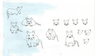
Animal Testing - Lab Rats

I realised for my sketchbook work to help with the development of my project as a whole I need to decide on some social issues to use as subject matter so I can explore the conceptual side visually. 


Making the subject character based, it de-sensitises the issues although this could be argued the opposite way depending on the approach. A simplified mouse figure makes it feel less real. It shifts the theme of the issue from cruelty to cuteness. 


Use of narrative and also use of children to show innocence. The parent's response seems shocking in response to this innocent request and makes this character sound kind of heartless and unfair. Then the reader realises that this is the attitude society has towards animal testing - most of us prioritise our own health and wellbeing and our need for products above the lives of living creatures. 


Straight to the point, shock tactics. Showing the reality. Would anyone want this image in their home? probably not. The more subtle approaches are more appropriate for my rationale. 


Narrative, again using shock tactics showing the reality of treatment of an innocent animal. It shows fear and portrays the human as the villain. 

I feel like this work is demonstrating the techniques I am seeing in adverts but i'm not hitting the nail on the head. Its not getting to the point of what I want to say. 


This sounds a bit irrelevant but I saw my dog's toy on the floor and had a bit of a brainwave. Poor Minnie had been ripped apart and looked very sorry for herself indeed. Brands have this connection with us that make things seem familiar and therefore when issues are related to this familiarity, the emotional effect on us is stronger. 


Mickey doesn't like being a lab rat and it seems that we feel more sorry for this fictional character because we feel like we know him personally.

This exercise has been really useful to me. I have been trying to use different methods to figure to what has the most impact and what is the most appropriate for the brief I am working to. I am starting to find the connection between the issue and the character/brand as shown by these drawings that followed, but I still don't think I'm getting directly to the point I want to make. I also think I'm still quite far away from my proposed outcomes of a range of homewares so the development of this needs a lot more work.