Saturday 31 December 2016

Continuous Line

I tried to apply the process of breaking down an image to money as it is something familiar that may become unrecognisable to someone with dementia. This isn't working well. 
Why? Aside from the little details on a coin, the general shape is round and too simple to dissect and distort. The colour is too distinctive to play around with. I am going to move away from the money idea. 


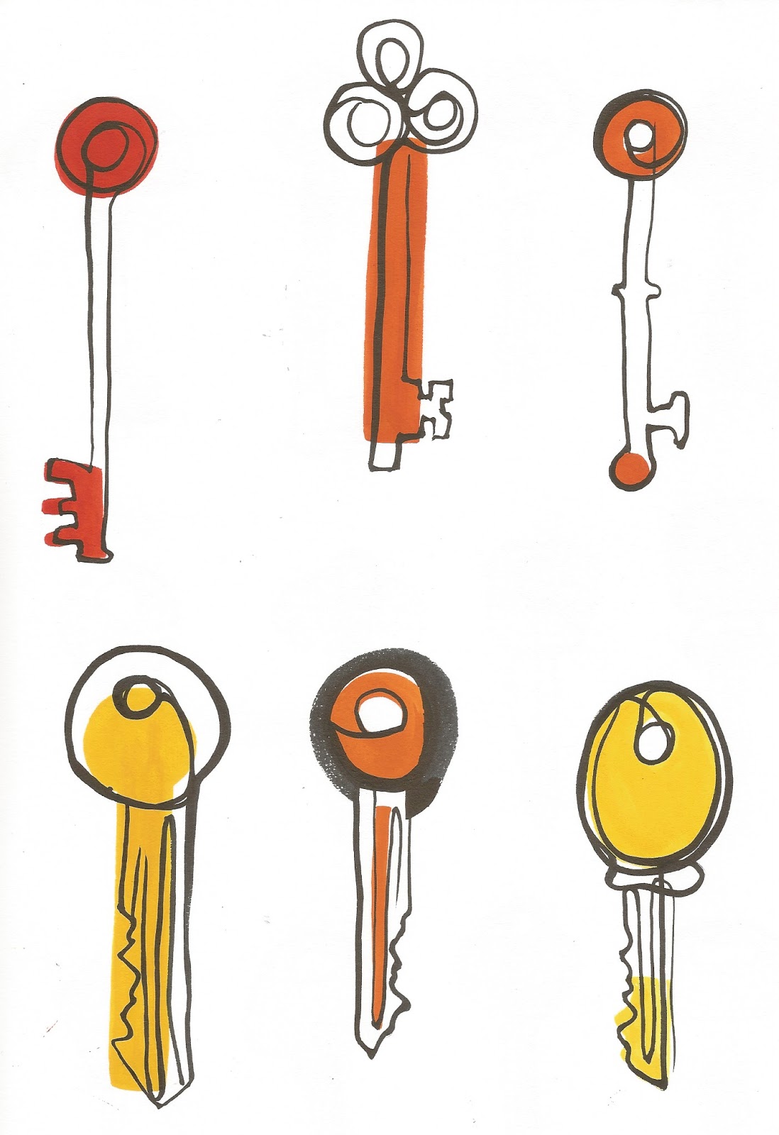
Keys. I took inspiration from the lost property video for this subject matter. I like how this process is developing. A more complex shape works better because it can be split up into smaller, simpler shapes. Even when broken down into fragments it is still recognisable what it is. 
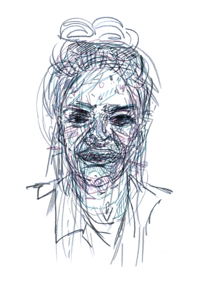
I can see my line work improving just over these two pages, the fluidity of brush pen is working well for continuous line drawings. It gives a clear outline while showing confusion and abnormality at the same time. Keep going with this. 


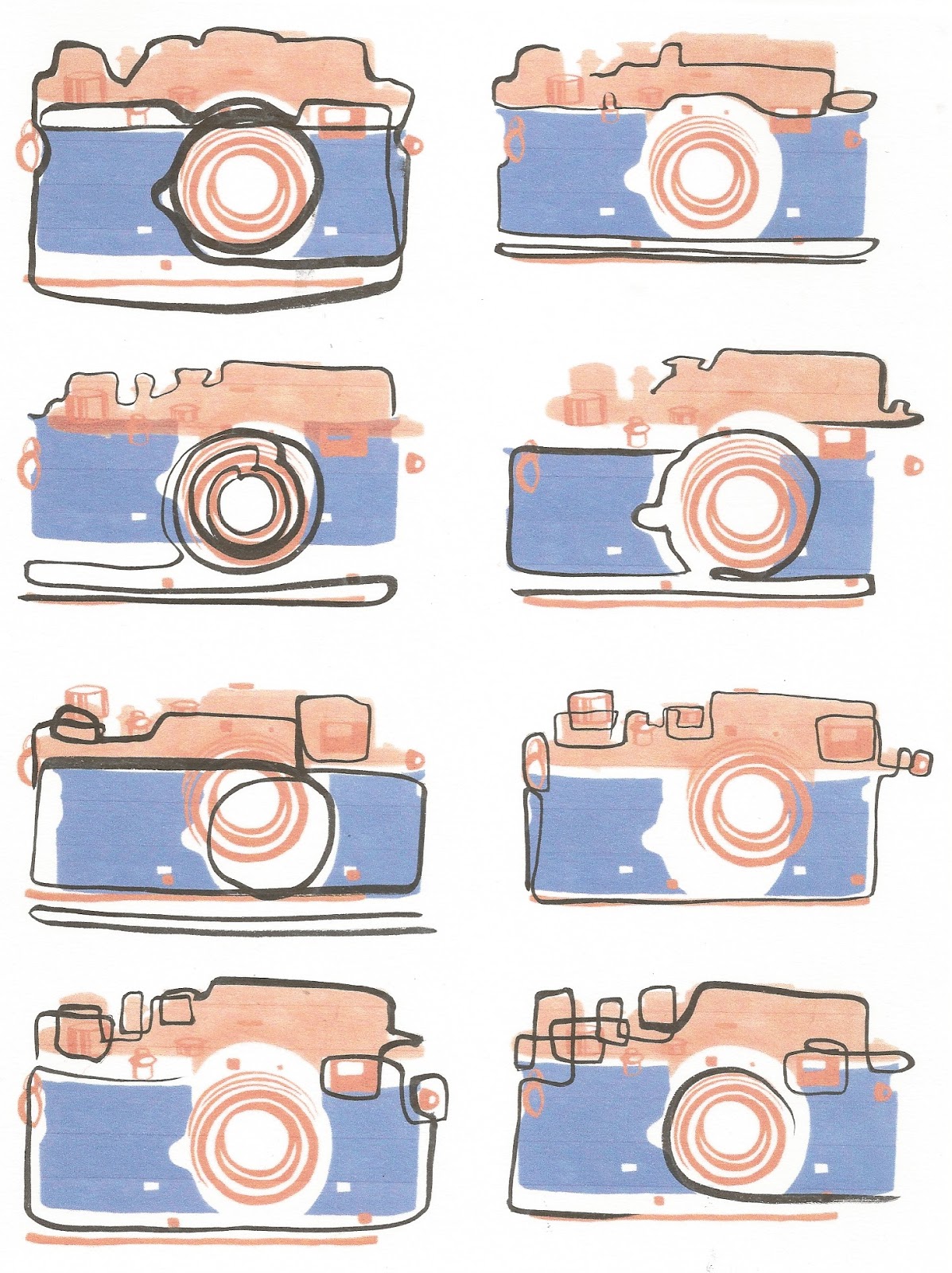
I tried the continuous line process over some past camera images. I think this process of layering shape and line could work well across all my images, it just isn't working well on this example. The colour painting here is a bit too complex as there is orange line work which causes a clash with the black. Do I use this line work for the whole image or just small detailed parts like the lens and where the buttons are...? Something to think about. 


I think the combination of these processes has potential. I also think that with some more development, the I can make the shape element fit with the 50s theme I have been looking at. Using my research as a direct influence from this point onwards might drive my work to a more developed stage.  

Synthesis with essay...
I am now reaching a point in this project where I have used my research about the social issue to develop a visual style that reflects the issue itself. Now i'm moving on to making this fit in with my trend research it moves on to making the images marketable to a certain audience. I think now is the turning point between a project driven by a care for a social issue and a project driven by commercial potential. This is what I have been trying to get at through doing this project - understanding where this change in approach happens. 

Friday 30 December 2016

Practitioner Research

These are the artists I have been looking at in relation to my practical work. 

Alan Vest
  • The combination of line and collage is relevant to what I intend to produce. 
  • Although I won't be drawing faces, I can take inspiration from his varying line weight to play with depth in my images. 
  • Colour is something I still need to consider. The black and white line work gives the image stability - as my work needs to looks quite unstable maybe I would be better working in full colour. 
Lucii Robinson
  • Drawing over an existing image would be a good idea to explore in my sketchbook - layers!
  • The images appear agitated and stressed, there is definitely the element of confusion that I am trying to achieve. 
  • The image on the right is more successful in my opinion, maybe it is the multimedia approach that gives the image another dimension as appose to just line work. 
Martin Haake

  • Collage based work - connects to the shape aspect of the work I am producing. 
  • These images are not representational of real life, they have a warped perspective and unrealistic figures. 
  • I like the textures in this work - it brings an element of the real world into this strange, misshapen world. Maybe scanned or printed textures/patterns could be included in my work to get across a sense of the real world still existing as part of the distorted world someone with dementia can see. It would be like confused familiarity. 
Jackie Parsons

  • She includes mark making, pattern, print, collage, photography, etc in her imagery. A total mix of media and resources. 
  • I like that not all the layers match up perfectly and you can see the contrast between the different media and processes used. 
  • Good reference for looking at building up an image in layers. 


1950s Research


After deciding which decade I wanted my imagery to be inspired by I did some visual research into the trends of the 1950s. 

  • Furniture is very shape based, curved lines or straight edges with rounded corners. 
  • Colours are bright yet not gaudy or overly loud. 
  • Patterns combine shape and line, some is very reminiscent of collaged paper. 
  • Colour schemes are usually three or four colours combined with black.
  • Patterns can be used as inspiration for colour schemes.
  • Fashion examples are shape based too, the female silhouette either appears very sculpted or very block-like. 
  • Colours are carried through to technology, as is shape. 
  • Technology could potentially provide subject matter for my images. 

My main finding from this research is the strong use of colour and shape. Layering of block colour and line is going to be the main way I construct my images. I want to use this 50s influence but also add a more contemporary twist to make it appeal to the consumers of today. 

Lost Property - Short Film

Lost Property from Asa Lucander on Vimeo.


The film is about a lady who comes into a lost property office regularly with photos of items she has lost, the man who works there tries his best to help her find them. He shows her rooms specific to umbrellas, keys, etc, in the hope that she will find the one she lost, however he always fails to do so. As the film goes on the world becomes increasingly imaginative and fantasy-like until we realise it isn’t real at all. 

Instead of the photos being of just an object, they transform into memories on the page. The office transforms into their bedroom and it is discovered that the lady is suffering from memory loss and lives in a care home. 

Losing these objects is a metaphor for forgetting and finding them is remembering. I thought this was such a sensitive and heart warming way to show this, and the fact that her husband is there helping her to find these memories them shows the kind of support he is giving her. It is true that objects can be memories. 

Watching this film has steered me towards the kind of subject matter I want to work with - objects that hold memories and object that are commonly lost. This is still broad but things like keys, jewellery, records, souvenirs, etc all have a story behind them and a connected memory that is individual. 

Objects can represent memories. Therefore the visual distortion of objects in my practical work shows how memories are affected by dementia. 


Kirstie's Vintage Home - Book Research

Kirstie's Vintage Home - Kirstie Allsopp
(not an academic reference but she knows a lot about vintage style in relation to the home environment.)

'Ultimately my message is this: the past and crafts go hand in hand because they're both about seeing the potential in things for your home and giving them a new lease of life. Whether it's painting an old chair, displaying vintage tins or making cushions from period fabric, if you surround yourself with things you love, you are creating a beautiful home that reflects who you are and what you are all about.' 

This fits with my proposal that the imagery will be created by analogue methods. It also mimics the message from my essay that you use products in your home to reflect who you are as a person.

'What is vintage? Nowadays the word 'vintage' is bandied about all over the place, especially in relation to style and fashion, but I think it's just a spark way of saying second-hand. Of course, The Oxford English Dictionary gives a slightly more elevated definition, saying that vintage 'denotes something from the past of high quality, especially something representing the best of its kind', so let's use that as a starting point. Furniture, soft furnishings, crockery, china, absolutely anything for the home can be vintage if you're not the first person to have owned it, though it must be from the past and less than a hundred years old - any older makes it antique.'


'A house decorated from top to bottom in a 1930's style ... could very easily look said and feel more like a museum than a home. Our homes have to reflect the fact that we live in a modern world, otherwise they will be completely impractical. It's all about taking the best from bygone eras and adding your own modern twist.'

Mixing vintage and modern to create something new - this project isn't about creating imagery that looks old. The modern twist is what will make it marketable today.

After reading descriptions of the styles of the decades in the 1900s I feel that the 1950s would be the most appropriate era to base my work on. This influence may not be too heavy but I think its a good idea to have a more specific influence than just 'vintage' because this is so broad. I will probably pull influence from other decades too.

1950s...
  • Wages increased and the British economy was growing. 
  • People started going on foreign holidays. 
  • Technology stepped up its infiltration into our homes - televisions, washing machines, fridges, food mixers...
  • The Festival of Britain 1951 - showcase of history, culture, design and art. 
  • People could by off the shelf vinyl paint - the dark colours of the 40s were left behind.
  • Fabric trends - bright, bold florals or abstract patterns inspired by advances in science. 
  • Furniture - higher frames, sleek lines, elegant shapes, Scandinavian influence.


Tuesday 27 December 2016

Sketchbook Cameras


  • Applying the symptoms of dementia visually onto a product
  • Continuous line - trying to show confusion, a tangle, wobbly, some areas are faded, reflecting the mindset of someone with dementia. 
  • Brushpen - loose drawing, not as successful as pencil crayon. Child-like drawing - shows how they think they are younger than they are, they can have childlike tendencies too. 
  • Combining media - I like the idea of layers… some is real world, some is confused world. Pieces don’t fit together properly. Overall confused image. The piecing together of the different elements goes a little wrong as the pieces aren’t in the right place, this shows how a person with dementia sees the world.
  • Ink - fluidity. Things are changing. Fading. Patchy. Having some things in clarity and some blurred. 
  • Pushing the layers idea. Neat and structured but still not pieced together correctly. Think back to my collages in previous sketchbook...
Ideas for development 

Keep going with the layers idea. This is working well and I can see this working across the set of images.
The pencil crayon drawings (pages 8-9 on issuu) were the most successful in my opinion. Maybe having multiples of the same object distorted to look different could be a good approach, it makes the subject matter easier to understand but emphasises the distortion and confusion that is taking place. I think the colour versions are working well, this is something to look into and make some decisions about - what colour scheme will I be working to?
I thought the combination of continuous line drawings and shape would have worked out better than they ddi so I am a bit disappointed by this. Maybe I am just to using the right media for each component. I think the line work needs to be finer and the shapes should stay bolder. Look at practitioners who use continuous line. Would a variety of media in the same image work well? 

Push the idea of confusion. Disorientation, agitation, reference to verbal stuttering, sight issues and not believing reality will all stem from this. 

I like the idea that cameras represent making memories because it feels relevant to the issue of dementia, although I will need to find a range of relevant subject matter for my final images. More research and inspiration needed here. 

Thursday 22 December 2016

NHS Research

Medical research into dementia - understanding the symptoms and effects. 


In summary...
  • Memory loss
  • Confusion
  • Personality/mood changes
  • Depression
  • Difficulty recognising familiar things and people
  • Speech difficulty 
  • Mobility issues 


Wednesday 21 December 2016

Emmerdale Dementia Episode


I saw an advert for an episode of Emmerdale solely based on one character suffering with dementia and thought it would be worth a watch. I know enough about Emmerdale to follow the storyline so I thought this would be a good insight into the effect dementia has on people. 


The main character in this episode (Ashley) is suffering with early-onset dementia. The episode has been created in partnership with dementia experts and charities. 

Observations:

Contrast between real life and what ashley sees/thinks. Ashley is actually in his pyjamas after walking out of hospital but he believes he is properly dressed.

Characters were changed to lookalikes to show an inability to recognise people. 

Unable to recognise everyday things like money.


Returning to the original village the soap used to be filmed in. The character believes to be living in another time - he speaks about returning home to his mum who has been dead for years. 

Blackouts, problems with vision, feeling disorientated.
Unable to recognise pictures, seeing them as shapes or distortions. 


People’s attitudes towards Ashley - impatient, not understanding, aggressive, patronising, some are helpful and understanding but Ashley is not trusting. 

He feels he is still capable of being independent. 

Overreacting, agitated, paranoia. 

Problems with speech, stuttering, outbursts. 

Monday 19 December 2016

Revised Practical Brief

BA (Hons) Illustration - Level 06
OUIL601 Context of Practice
Practical Brief

Brief Title
Commodification of Social Issues 

Brief
Produce a body of imagery to raise awareness of the social issue of dementia. The imagery needs to be on trend with a vintage style influence and appeal to an adult audience aged 18-35. The imagery must be appropriate for digital application onto products which can be found in the home or used as part of everyday rituals. 

Product
A set of images appropriate for digital application onto products. 
Include colour variations and proposals for pattern as well as spot images. 

Audience 
Young adults (18-35) who follow the vintage trend.
Any gender. The range of products and colours will mean some products are more appropriate for either males or females but the range overall should be unisex. 

Additional Information/Considerations


Images must not be offensive or unacceptable to be viewed by anyone outside of the proposed audience as they will be viewed by a much wider audience than the specified age range.

Mandatory Requirements 
A set of at least three spot images than can be applied onto a range of products. 

Deliverables
Either a book or boards displaying digital mockups of the proposed product range in context. 
Presentation boards showing the conceptual and practical development of the project. 

Saturday 17 December 2016

Vintage Trend Research

Examples found in catalogues and gift guides...
  • Primarily related to homeware - relevant to my proposed outcomes. 
  • This trend is clearly relevant across a wider audience than young adult 'hipsters'. 
  • Do I want to focus on this audience (slightly older and more affluent) or focus on the targets of the vintage fashion trend ?
  • The younger audience would allow for more experimental outcomes - it would also fit with my research into hipsters and bohemians in my essay. 
  • Make some final decisions and re-write my practical brief for a final time. 


Thursday 15 December 2016

Dementia - Primary Research

Dementia is something my family has been affected by so I feel like I already have a good knowledge of the topic and a personal insight into the issue I am working with. When I was visiting my nana in an advanced dementia/nursing care home I managed to take a few photos of the environment and also speak to some of the staff about the issue of dementia and an ageing population. 


The carers explained that they try to make the environment as homely as possible and full of memories (if this is appropriate for the individual). Personal photographs can help to keep things familiar and also objects and ornaments that they may recognise. It depends on the severity of the dementia, some patients are past the point of being able to recognise family members. 


In the corridors of the care home they have lots of pictures of old fashioned branding, postcards, adverts, etc which the carers said are all there to help trigger memories from earlier in the patient’s lives.

I have seen on numerous occasions people who cannot remember their own family who are sitting right in front of them but they can remember all the words to songs from the 50s. It’s really baffling but the condition is obviously really complex. 


They explained to me about the street names too. Each corridor has a street name and each room has a ‘house’ number. For some dementia patients, its important to them that they still feel independent and having their own ‘address’ is part of this. They also said that for a lot of patients its best to go along with what they say to avoid constant confrontation and upsets by explaining their situations. The most important thing is keeping them happy and playing a part within the world they think they are in is comforting to them. What is agitating is trying to explain to them the real life situation they are in. 

Along the handrails in the corridors there are stuffed toys, musical instruments and textured objects. Apparently a lot of dementia patients have problems with the signals from their senses to their brain but having something tactile to touch is a reassuring experience. Things that are comforting to touch can be settling, especially when their sight and hearing may be impaired as a part of the condition and they struggle to build up a picture in their mind of where they actually are. 


Today has been a really interesting and eye opening experience for me. I have had a personal experience of seeing someone suffer with dementia, I have seen how it affects and individual and a whole family but today I learnt more about how it is dealt with and the care aspect of the issue. 

Because I have this personal connection to the issue I think the work I produce will feel more genuine and authentic than the work I may have produced for an issue I have no real experience of. Therefore choosing this topic will make the commodification of the issue even more noticeable and feel more deceptive and insincere to me personally. Hopefully it will make people understand that this is what is occurring in consumer culture all the time, social issues are commodified (often quite heartlessly) to sell products.


Wednesday 14 December 2016

The Meaning of Marxism - Paul D’Amato

‘Many young people who are horrified by the inequalities of capitalism are motivated by a belief that one can change the world by changing one’s own moral outlook and behaviour.’ (p25-26)
‘But this approach, though it might help its practitioner feel better about him/herself, doesn’t change anything.’ (p26)
People think that they are actually making a difference by buying products when really it inly really makes a difference within that person, not to society. 

‘…the idea that value is equal to price and price is determined by a commodity’s relative scarcity or abundance.’ (p50)

Use in chapter four when considering contextualisation - where will this be sold. Will it be worth more selling to a niche market? This could push the idea of the project being about making money rather than making a difference.

Benetton Campaigns Research - Salvemini

The Benetton Campaigns United Colors - Lorella Pagnucco Salvemini

‘With Toscani, communication is through silence. What is publicised is absent, goods that are not seen, something intangible and mysterious and for this reason very attractive.’ p16
Use this to explain how products are not shown in ads. Therefore the message of the advert is all about values and morals rather than product, what is actually for sale here?

‘The consumer acquires the garment as tangible sign of having achieved emancipation.’ p16
Use in Callaghan section to link back to Benetton. Buying something to show you are a good person. 

Jean West’s brand ‘showed the new woman, independent and self-sufficient.’ 
‘She had adopted typically masculine behaviour’
She ‘wants to be free, strong-willed, energetic and virile. For this reason she dresses like him.’ p19
Use in H&M section to support idea of demoralising females by making them more like men to show power. 

‘concentrated on the paradoxical use of black and white in colour photography.’ 
‘It’s objective is to induce purchases, and for selling it must capture the consumer’s attention’
‘Now advertising made a bold leap forward from the then - current way of working: ‘not to increase the saleability of products but to offer values.’ p44
The end of this quote could be used in the introduction or conclusion to support basic statements outlining the question/conclusion. 

Vance Packard ‘we know that the functional need for a garment carries practically no weight in these situations.’ p44
People don’t need these products. They are a symbol of a greater message and moral and that is what people really feel like they ‘need’.

‘Each person seeing the picture will inevitably make a decision, based on awareness, experience and most of all, personal prejudices.’ p46
Unconscious bias in benetton section, chapter three. Ref picture p46. - another example of binary opposition. 

Toscani has a ‘firm belief that the development of mankind of the past was through freedom, lack of prejudice and awareness of their thinking.’
‘the paradox of the self-conferred role of public moralizer’ p47

‘By illustrating contraceptives, it is an implicit recommendation to use them, particularly appropriate in a period devastated by he spread of AIDS.’
‘From advice to action. This time the adverting went further, with the incredible arrangement that all Benetton shops would distribute free condoms.’ p49      Ref photo p50
Criticism from Gianni Vattimo: ‘I have the strongest doubts that publicising the condition of AIDS will contribute in any way to limiting the damages of this disease.’ p93
‘The suspicion is that the charge of using the tragedy of others for commercial gain hid deep feelings of condemnation towards those suffering from AIDS.’ p93
Use the AIDS case study in chapter four to outline what I am mimicking with my practical. 
Last quote is most important - publicising the issue wont make a change to the actual disease - same goes for dementia. 

‘Once the benefit derived from the shock and the widespread free media publicity that unfailingly followed it had worn off, the disquieting association between the label and disturbing events drastically prevented any possibility of dialogue between Benetton and the consumer.’ p126

‘In the early days Benetton customers could enjoy wearing clothes that made them feel politically correct.’ p126
Buying values, virtue signalling. Why is this just accepted as an idea? How does an item of clothing hold a social value?

‘Works of art were often intended to shock conventional people and stimulate deep thoughts about society.’ 
Without the connection of the brand, the artwork itself is more successful at provoking a change in society. There is no ulterior motive behind the image if it is not being used to sell anything.